Friday, September 28, 2018

Decorating With The Color Raspberry


Raspberry is a gorgeous and trendy color, that is a bit more chic and sophisticated than most shades of pink, making it a popular choice for updating interiors in everything from traditional to modern homes. A grown-up shade of pink, raspberry is more on the red side and decorating with raspberry will give your interiors energy and playfulness without making them too ultra feminine or sickeningly sweet. 

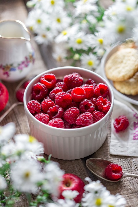
While gathering images for you I was surprised to see that people are referring to ever shade of pink on the planet as raspberry. I have see everything from burgundy to neon pink. The reason I have added several pictures of raspberries in the body of the blog is to keep your eyes focused on what color raspberry actually is.

Those of you who follow me know I am partial to old world interiors so you will see the old and the new all done up in the color raspberry. These interiors are simply DELICIOUS and decorating with the color raspberry will show the world you have GREAT TASTE!


via pinterest

The color raspberry is like the yummy fruit itself..... a bit sweet, a bit tart, sort of a rich, edgy reddish pink.


Beautiful raspberry damask window treatments and wallcoverings in a fabulous former French residence turned museum. They were not afraid to use color in the 18th century. Pair it with a rich cream for a luscious look.

Le salon de Mercure, Palace of Versailles

This image shows how gold and gray make pretty companions for raspberry walls.

Raspberry is a stunning color choice for sofas that will make them look elegant and rich.

This raspberry and gold window treatments is soooo beautiful.


A lighter shade of raspberry silk moiré in the queen's bedroom at the Chinese Pavillion at Drottningholm Palace. Look at how pretty these rich shades of blue and green work with the raspberry.

via Pinterest

Even in nature raspberry is at it's best accompanied by gold, or in this case brass. And the green stems for accent!!


Crystal sconce and raspberry shades.......perfect for when you need a bit of this color to accent with.


Or maybe a raspberry colored throw tossed on your bed.


This window treatment uses a deeper shade of raspberry for a warm elegant look.

photographer Francesco Lagnese

This lovely traditional interior by designer Miles Redd
is so stylish in raspberry lacquered walls. The gold accent trim provides a touch of opulence.


Green, yellow, and raspberry is a beautiful color palette. Don't forget that you can create a portiere for a doorless entrance to a room. Another way you can incorporate a bit of raspberry to your room.

via Pinterest

Raspberry and lemon yellow.....one of nature's color combinations.


I love this colorful and fun dining room. Raspberry looks so good with dark colors like black, gray, and even navy. The touch of yellow in the painting adds so much!!


And of course there is chartreuse, raspberry loves it!! In a room with this much chartreuse you want the raspberry to accent in small doses.

google.com

What can I say....mouthwatering perfection. Raspberry velvet is so rich in it's depth and texture.

via Pinterest

The walls are striped in two shades of raspberry. To make this space even more stunning, raspberry pillows have been tossed on a cream painted French cane settee. 


If you don't want your room to look like the inside of a raspberry smoothie, try adding just a few pops of this color to pump up the playfulness of a room.

French Basketeer

Better Homes and Gardens

Since raspberry is little more subtle than hot pink, it blends better with warm colors.


Cream on cream is a pretty background for raspberry. Add in some soft blue for a pretty feminine farmhouse look.


The bath is a good place to play around with the color raspberry just to see if you like it.

via Pinterest


And why not have a raspberry colored kitchen!

via Pinterest

via Pinterest


If you long for a pink bedroom but can't get the husband to go along with girly pinks, try raspberry....... he might go for it's richer tones.

Raspberry is a bold color but the look can be softened by painting walls in a variety of creams from light antique cream to a pale shade of yellow.

via Pinterest

The color raspberry is also showing up more and more in painted furniture. Isn't this stunning against a gray wall?


Try blending calming, classic neutrals with raspberry pink .....especially when it is presented in an exciting geometric design like on this traditional sofa.


This modern traditional dining room by designer Peter Marino was updated with raspberry walls. Deeper shades of raspberry create very sophisticated spaces.

via Pinterest


Darker rooms also need colors that are more saturated, since there's less light available. Raspberry shines as an accent color for these darker rooms. Black, gray, and raspberry is a color combination that gives your room an Art Deco feel.

interiorsbycolor.com

The color raspberry is versatile and can be used to accompany neutral color tones as well as bold and bright choices. Try a raspberry painted floor.

Miles Redd

Raspberry saturation, but done in such a nice way.

via Pinterest


You might even try making a entrance with Benjamin Moore's Raspberry Glaze.


Click here to see the previous post


This blog post was published by Lisa Farmer

Friday, September 21, 2018

My Old World Master Bedroom Suite


Last year, since you were all so kind to ask, I promised many of my Facebook and Eye for Design friends and followers that I would show some pictures of my own home. You have seen blog posts on my living room, dining room, hall and kitchen. That leaves the family room and the master bedroom suite which includes my office. The two bedrooms upstairs became my husband's man cave since our son moved out. Although he has it really nice it won't be on the tour. I have not taken the time to take house pictures for almost a year, so in order to fulfill my promise I thought I would go ahead and feature the bedroom first and sometime before the end of the year I'll get around to the family room.

I thought it would be easier to include the bath and my office since they are actually part of the bedroom suite. The bedroom is eclectic old world in style somewhere in between classic and country manor. There are French influences as well as Neo-classical, and English. I have plans and projects ahead that will tilt things more to the French side. Will update as I finish projects, but for now, this is it. I hope you enjoy.


Looking into the bedroom from the door leading outside. This room is painted in a soft blush tone that is hard to photograph and changes color depending on the time of day. The truest color will be what you see on the lower parts of the walls where the golden incandescent lighting doesn't interfere. I painted this old desk about 15 years ago. The four poster was handmade by a man in Lexington and I have had it through my 80's primitive colonial stage, through English and now into more Old World. My plan is to turn it into a lit à la polonaise style bed and am looking for a coronet. A project for when my back gets better!!


I am so fortunate to have this great window seat in the bedroom. It's one of the things that sold me on this old house. That and the 12 foot ceilings. The old wool tapestry came from an auction in northern Kentucky and is hand appliqued. It is in soft muted colors on a dark green background that simply do not show up well in the camera light. I am planning to change the window treatment soon to something that enhances the hanging.......so many projects, too little time.


I love antique textiles, especially those that are hand made. I try and buy any that I find at prices that don't break the bank. There are so many places you can use them to give your home an old world feel.


Here is a closer picture and you can see the colors a bit better.


You can see the applique work and hand stitches better here.


Just a little vignette in the space in between rooms. I collect old family crests.......any name will do!


Looking through the bed into my office. This room has five doors, a fireplace, and a window box which makes it hard to come up with wall space for some other pieces I want........like an armoire.


You go through this pocket door into my office.


This area is a combination of French and Neo-classical. I love reliefs, Greek key patterns, and other classical elements and think they work well with French furniture.


My desk is a big trestle style with carved legs and feet that you can't really see in these pictures. I found an old watch makers cabinet that sits on top of it. The French phone was a birthday present from Tim. The French girandoles were found in a vintage car parts junk yard. They were apart and in a box.....for $50.00. There is a story like that behind everything I have. God leads me to some incredible finds!!!


I wish you could see the watch cabinet better.....all these little drawers and slots. The piece at right was made by my great grandfather and I have considered painting it but just don't have the heart. Above the desk is an antique needlepoint picture of a young French falconer. A treasured gift from a friend in France is displayed in the cloche.


This room is prettier if you are actually standing in it. It's not that big so it is hard to photograph to get full views. The panels were old Chinoiserie panels that I painted and stenciled with joint compound for a raised Venetian plaster look. This window is one I keep shuttered so I also covered it with a tapestry and framed antique French needlepoint seat cover........pretty muted pastel colors that again just don't show up well.


The little antique bench is where you will usually find a sleeping cat. Sophie, Chanel, and Buddy like to relax here while I am Facebooking or working on a blog. The old pillows are petitpoint and are of French chateaux. I am probably going to paint the slant top desk cream as a winter project.


The closer the camera the more color you can see. There is alot more blue but just doesn't show up well no matter what I do.


I have several crystal chandeliers throughout the house and wanted something different but similar to go in my office. I looked for over a year for one of these antique Italian vine chandeliers. The crystals fit into metal buds so it looks like they are blooming. Found it finally and the price was RIGHT. Tim did have to rewire the sockets as they were Italian and did not fit our bulbs.


This year I purchased this large old unframed oil on canvas that  really impacts the room. Hard to tell here that she is 60 inches tall. My vision was to put an antique French daybed here underneath it. However, my back dictates that it does not want to go up and down basement stairs to wash clothes. So the washer and dryer now sit here instead. Dream has been put on hold until we can convert a covered porch to a mudroom. People say to look on the bright side though an embrace what a pretty laundry room I have.


View from office into bedroom that shows the French screens on either side of the bed. It actually has four panels but I have them split and folded for now.


I have tried to change the camera setting so the colors are a bit truer even though now the green is weird. The screens are actually covered in blues, greens, and deep reds on a cream background. Also blues in the needlepoint pillows.


Looking through door leading to the hall.


Another of the MANY doors. This one leads to the bathroom.


I have to tell the story of the mantle. There is an old lady in town that we help from time to time when she comes by needing food or some other assistance. She has a roof over her head but no electricity, water etc. and won't go anywhere else. She is a hoarder as well.......like on TV. One day this huge man shows up in a truck, knocks on the door and says "Deborah wants you to have this". I didn't argue with him. Where it came from I don't know. Anyway it went perfect in my bathroom and I am glad to have it.


I will eventually do something different underneath it. Without the camera flash you don't see the stripes so it does look better. Just French script showing.


The crystal chandelier and sconces wash out the green, deep reds, and blues in the pictures and the acanthus leaf boarder under the leopard print. However without them on it is too dark.


I turned off the sconces but it still didn't help. There is a pretty little French demilune table with painted flowers on it that just doesn't show up.


I love lidded garden urns! The red you see in the stair well runs through all these rooms but for some reason it shows up well here but nowhere else.


Looking down the hall.


Usually Chanel or Sophie are the ones interested in getting their pictures taken but today Buddy wanted in on the act. He turned up at the end to say good-by.

Related Posts Plugin for WordPress, Blogger...
 Follow Me On Facebook Follow Me On Pinterest Subscribe to my RSS Feed Send Me An Email