Wednesday, September 30, 2015

Decorating Bedrooms In A Pale Color Palette


Nothing beats a pale color palette for making rooms feel pretty, soft edged, and inviting. And these soft and soothing hues make any bedroom look timeless and sophisticated. Since color not only reflects your personality, but also the function of the room you are decorating, a pale color palette will certainly set the stage for a bedroom that is perfect for relaxing, cuddling, and disconnecting from the world's hectic pace. 

Natural hues are today's hottest pale options for modern bedroom walls with names like gardenia, quartz white, ancient marble, opaline,veiled violet. However, the pale color palette is still very popular for Romantic Old World and Shabby Chic style bedrooms. The trick is to not make your space feel so sweet that you lose the sophisticated edge.

I have gathered some images of pale bedrooms that I think reflect elegance and refinement as well as the invitation to snuggle up and unwind. Remember it's not only about the paint, it's about textiles, patterns, and beautiful accessories.


Of course ivory walls provide the opportunity to experiment with pale colors on the bed and accessories. This room features bedding with delicate touches of pale pink. For a perfectly cohesive look add flowers, upholstered pieces or other accents in the same color family.


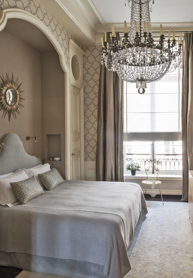
A pale palette bedroom can easily appear too flat if you are not careful to mix pattern and texture. The faux painting technique on the walls give depth. Try and imagine this room with just a plain painted wall. It wouldn't be near as lovely. A pale, subtle wallpaper is another great option to bring interest to pale walls.

admagazine.fr

I adore old world bedrooms like this where a pale color palette is pure perfection!

via Pinterest

A pale color palette doesn't mean you can't have a punch of color. Just make it small and don't use a bright color. Stay more in the muted tones.


In fact a pale color palette can act as the perfect backdrop for bringing in other tones, giving you room to experiment with contrasting colors. Even though this is a strong color, it still is a soft shade and the room still maintains a soft feel.


A pale blue color palette, enhanced by ivory accessories, make this bedroom more complex and sophisticated.

John Jacob


The new opulence.......bedrooms with a hushed, pale color palette.


Trying a pale color palette in your bedroom will give you a chance to work with brighter and darker shades within the same family.

via Pinterest

We instinctively seem to gravitate towards a paler color palette that remind us of the softer calmer life when we want to create a bedroom haven for rest in a stressful world. 


Bedrooms that have been decorated with a pale, muted, aqua color palette always seem to have an inviting fresh feel.


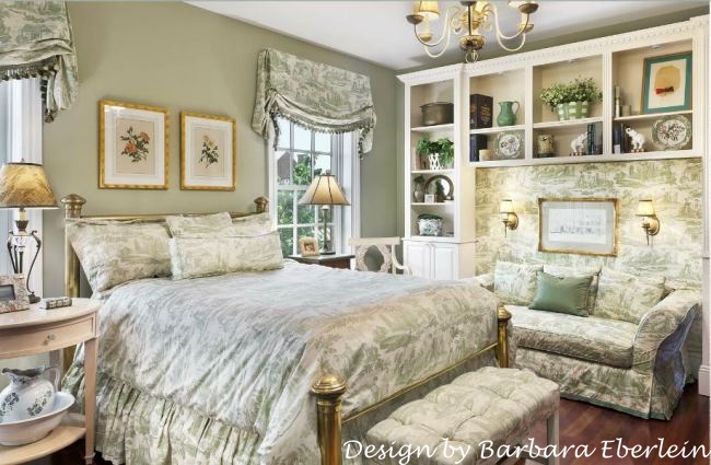
Even though there is a hearty mix and match of pattern, the pale color palette keeps this bedroom on the soft side.

via Pinterest

Just because you choose a pale color palette doesn't mean your bedroom can't have a rich, regal appearance.


Beiges, aged whites, and grays are wonderful canvases that allow you to play with color. Ivory, pale aqua and lilac is a wonderful pale color palette to try.


Ralph Lauren

This bedroom's pale color palette features several beautiful colors in soft muted shades.


A pale color palette softens this bedroom's eclectic mix of home accessories.

Tiffany Eastman

The pale palette of barely there colors makes this bedroom appear romantic and luminous even with the bold zebra rug.


This pale pink, gray, and ivory color palette is not sugary sweet but has more of an old world feel. When using pink in a pale bedroom I recommend leaning towards a shade that would be considered nude.

via Pinterest


A pale color palette makes this bedroom a slumber-worthy space.


source unknown....would love to give credit to the designer if anyone knows it is.

Today's cottage style decorating is about soft colors, vintage furnishings, feminine florals and a pale color palette is especially desirable.

via Pinterest

Pale pink accessories upstage the bedrooms beige walls with just a whisper.


A sophisticated vintage look can be achieved by combining a pale color palette with faux plastered walls.

southernpiphi.tumblr.com


Click here to see the previous post


This blog post was published by Lisa Farmer

Thursday, September 17, 2015

Decorating With Green And White Toile


Once a staple of formal decorating, French toile is making a huge comeback.Toile de jouy fabric originated in France in the 1760's and is that classic fabric that depicts pastoral scenes of the French countryside as well as Chinoiserie patterns and historical themes. Today there are many pattern choices and colors available.

This post spotlights green and white toile, one of the classic color combinations. Rooms decorated with green and white toile are fresh and crisp, light and airy. And with today's emphasis on nature, this color combo, coupled with it's natural pastoral scenes, is perfect for any style. You can drench a room with green and white toile for a more romantic, classic style or just add bits and pieces of it in more modern settings. However you decide to incorporate it into your home I hope you rediscover green and white toile


Toile has a distinct look whether it is green and white or in the wide range of other colors it can be found in. Here a dose of blue keeps the colors from becoming too saturated.

via pinterest

This green and white toile drenched bedroom works so well because of the painted woodwork. While I think natural wood and toile is a fabulous look, in most houses painting your trim really helps to keep the feel light and airy.


Toile fabric features colorful pastoral etchings in a repeated pattern against a cream or white background. If you paper a wall and white is the predominate color, make sure your accent pieces are opposite, with white florals etc accenting green backgrounds. Do the same if green is the predominate color on the wall, make sure your accent pieces are green on white.


I like touches of color in green and white toile rooms. While the classic way to use toile is more regulated to only the two colors, I think a more modern way is to pop it up with color.


Reaching the height of its American popularity during the Colonial Era, toile has at times been considered outdated, stuffy, and so not chic. But like all things classic this fabric has again been resurrected by designers. Green toile is a perennial favorite as is red and blue.


Diamond and Baratta

This image best illustrates how I would personally decorate a room in my own home in green and white toile. I like the touches of black, the patterns create by the harlequin floor and the papier-mache table, and large artwork that helps break up the toile pattern a bit.


Green transferware is a great compliment to green and white toile interiors. This piece features a castle scene.

Soothing green walls provide a pretty contrast to green and white toile curtains. Here the toile is used sparingly but makes a big statement.

via Pinterest

Toile is a mainstay of the French country style of interior design. Paint a French side chair white, add green and white toile and buffalo checks, and you have the perfect addition.


This room is saturated with green and white toile but doesn't seem overwhelming because the designer uses just the right amount of white to keep things light and airy.


Another popular look when using green and white toile is to use solids on everything but the walls.

via Pinterest

Take toile to the walls to make a major statement then repeat the pattern in tiny doses on such things as pillows, bed skirts, lampshades....you get the idea.

Photo: Tria Giovan; Designer: Phillip Sides via Southern Accents

Here the stage is set for a lively mix of fabrics and patterns.This traditional green and white toile pattern has a timeless quality that can be incorporated into any home style.

Barbara Eberlein

This green and white toile makes a statement but doesn’t overwhelm the space. Toile can also be used in an supporting role rather than as the headliner.

source unknown

Another way to give your space the feeling of green and white toile is to display a collection of green transferware. It resembles toile and is fun to collect.


Green and white toile is used at the headboard, balanced by clean lines of the neutral bedspread, green tone on tone patterned pillows, and plaid bolster.

cathy-kincaid.com

Once reserved for window treatments or upholstery, decorating with toile has returned to it's original French style of all over pattern.


Unlike red and blue, green toile can be used en masse without the feeling of heaviness.

Dan Carithers

However remember that a space does not have to be drenched in toile to be noticed.

Charlotte. Moss

I like mixing multiple patterns with toile interiors. These pink floral patterns work well with the green and white toile on the walls, windows, and bed hangings.


Green and white toile wraps this room in traditional comfort.


Vintage Wedgwood green Toile Transferware plate


French Bergere lounge chair upholstered in green and white toile. Nothing says "French" quite like it.


Dan Carithers room features Scalamandre Pillement green and white toile and buffalo checks.

The kitchen is another space that can benefit from the addition of a bit of green and white toile.


Part of the appeal of green and white toile is how it can easily make the transition from formal ........


.......to casual elegance. If you are thinking about adding French flair to you home you can't go wrong with a bit of green and white toile.


Click here to see the previous post


This blog post was published by Lisa Farmer

Related Posts Plugin for WordPress, Blogger...
 Follow Me On Facebook Follow Me On Pinterest Subscribe to my RSS Feed Send Me An Email