Thursday, June 27, 2013

Decorate With Matelasse


peacockalley.com


Matelassé (mat-le-SAY) is French for “quilted” or “cushioned,” and in usage with fabric, refers to quilted textiles. It is meant to mimic the style of hand-stitched Marseilles type quilts made in France The looms give the appearance of hand quilting. The fabric is a plush textile that appears to be padded, but actually has no padding within the fabric.The treads used for the quilting are done in the same color as the fabric so that the pattern is what you see rather than the stitches. 

 Today the term is most often used to describe double woven fabrics, often damask or jacquard, that are slightly quilted and that feature raised or puckered motifs on their surface. These mid to heavy weight fabrics are ideal for bedding ensemble because of their warmth, and are often stone washed for extra softness.

Matelassé fabrics are generally made from 100% cotton, but can also be found in cotton/polyester blends and chenille as well. Designs range from simple, graphic squares, or intricate floral motifs. 

  Matelassé is especially popular because it offers such a  classic, understated pattern. I find it very elegant and refined while at the same time comfortable and charming. It's worth your consideration  for a bedroom redo.


houzz.com

Add a bit of French or Old World European flair as you begin adding matelasse to your home.

The quilted style of matelasse makes it a great choice for a home with a “country” inspired design. This could be European country style but it could also have an American country decor feeling.


Beautiful toile matelasse!


A bed featuring toile coverings and matelasse shams.


What is more French than a matelesse tablecloth?

Mix some pretty sheets with a matelasse comforter.

Stunning!!  This is my favorite way to use matelasse. I like to mix fabrics and patterns and it's tone on tone makes it work so well with other textures and prints.

I think matelasse provides an elegant touch to any bedroom.


Pair matelasse with shabby chic floral patterns for a soft, romantic bedroom.

Matelasse looks very simple and elegant, AND  is very comfortable. Manufacturers claim that its casual design improves with every wash.


Look at this beautiful matelasse covered headboard.

Matelasse even looks delightful in this coastal cottage style bedroom.


Add matelasse bedding to modern bedrooms, toss it over modern sofas and use it to add some old-fashioned style to the windows of a modern home or apartment. All of these options bring an appreciation of an older style into a chic space.

It has such a warm and cozy yet elegant effect on a room.

While I think all colors of matelasse are exquisite, I have to admit I am partial to white or cream.


A white matelasse bedspread makes an elegant stand-in for a table cloth. Color comes from green napkins—draped at the edge of the table rather than sitting primly next to each plate.


Another great way to use matelasse.....slipcovers!


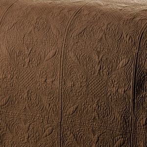
Lovely design on brown matlasse. It looks like quilting but there is no padding.

source unknown

Matelasse coverlets in gorgeous colors!


Floral and gingham with a  matelasse coverlet.


Click here to see the previous post!

This blog post was published by
Lisa Farmer

Sunday, June 23, 2013

Decorating With Pink and Orange


I remember being told to“NEVER WEAR ORANGE AND PINK TOGETHER BECAUSE IT CLASHES". I always thought it was a pretty combination. Also I never could understand how white became taboo after the first Monday in September either. Boy am I glad those days are gone. You see this combo on the runways all the time now.

Most people don't think to use these two colors because they are so close on the color wheel. I threw out the color wheel a LONG time ago. If you must rely on a color wheel to tell you what looks good together, I question your eye as an interior designer. Now that being said, if you like bright interior color schemes, this color combination will complement each other and make your room amazing and beautiful.Two equally hot, vibrant colors working beautifully together to energize an interior scheme. In my opinion they don’t overpower, but create excitement. 

My favorite look is using these colors against a white or cream background. But it can be equally lovely if you decide to go bold by using them in large amounts. There are many shades of each to choose from so you can go as bright or subtle as you wish. If you don't like bright orange, try tangerine, peach, or mango. Hot pink too much for you? Try a soft salmon, muted raspberry or French rose. There are shades of this combo out there I believe you can live with!

I have always loved this combination and wear it often. I have used it outdoors on numerous occasions while landscaping my patio during the summer. Pink and orange flowers are fabulous for gardens and landscaping .I have gathered some images that I believe will convince you of the beauty of these two colors when combined the right way. Enjoy!!!


This color combination can work in an old world interior. Just make sure the shades of pink and orange are muted.


The pink and orange combination is a growing trend in decorating and a good choice if you want a bold, fun and youthful room.

Orange is a combination of red and yellow, and pink is a shade of red. Therefore, the colors work together in harmony, making it an attractive color scheme for a room.


Adding pink and orange to a room with lots of white and plenty of greenery creates a tropical island feeling.

A more dramatic room with deep orange walls, pink and orange fabrics and tropical accents creates an exotic, Eastern-vibe in the room.


For the colors to work together in true harmony, you want to choose shades of pink and orange that have similar undertones. Shades of pink with cool blue or purple undertones will not coordinate well with orange, which is created from warm red and yellow. Instead choose a shade of pink that has a warm red undertone to keep the combination harmonious.


Pretty sherbet shades of this combination!


pinterest.com

Incorporate neutrals, accent shades and wood or metal to give the eye a place to rest among the riot of color.

This image show how well violet works as an complimentary color with these shades of pink and orange.


I adore the softer side of this combination.

pinterest.com

The softer combination of pink and orange used on this bed reflects my personal taste when using these colors together.

thefrenchtangerine....

I love this combination in doses scattered throughout so it doesn't become too overpowering.

This color combination is wonderful when used outdoors. It is bright and full of energy AND green is the perfect background.


Black compliments the pink/orange combination and adds lots of drama.


Another great way to use this combination is lots of white with just pops of pink and orange.


Using multiple sunset-inspired shades of pink and orange creates a romantic feeling. 


If you like this combo but can't take too much of it just do something small like cover a chair or hang a painting.


Bright pink and orange polka dots, stripes and patterns create a fun and youthful room.


White furniture is perfect against this wonderful pink and orange floral wall.

While this may be a bit too much for me, it's bright and cheerful if you are looking for those qualities in your interiors.


You have to admit, orange and pink is a lovely color scheme.  While white makes it pop, I like the more muted look of aged, soft creams and tans.


This is a wonderful combination for entertaining or weddings!


Visit my website at www.lisafarmerdesigns.com


Click here to see the previous post!

This blog post was published by
Lisa Farmer


Related Posts Plugin for WordPress, Blogger...
 Follow Me On Facebook Follow Me On Pinterest Subscribe to my RSS Feed Send Me An Email