Terracotta colored interiors and décor have been on an upward trend for a few years now but this color has finally hit it's stride. The resurgence in popularity of terracotta is because of it's mix of dusty pink, orange, and deep red that invokes a sense of warmth and coziness in rooms no matter how large they may be.
When you think of the color terracotta, flower pots and tiles immediately come to mind. Terracotta (meaning “baked earth” in Italian) has a long and rich history as a material used throughout the ancient world.
So why has the color terracotta become a major trend in interiors in 2021? Since terracotta is literally drawn from the earth, it evokes that connection with nature that people enjoy today. This warm neutral color creates a modern and rustic result at the same time that people seem to like. I hope this blog post will expose you to the new terracotta colored interior so you can see just how pretty a room decorated in this color can be. There is info and tips below to assist you in incorporating this relaxed and warm color into your home.
Since I am an "old world gal" this type of terracotta colored interior comes first on my blogs. Even though this color has been around for centuries now antique interiors can be on trend again too. The second half is dedicated to the more modern interior and how to decorate them in these lovely terracotta shades as well. Enjoy!

Terracotta traditionally dates back to China, Greece, and Egypt. However, the origins of popular, modern-day terracotta can be traced back to the classical architecture of southern Europe, which includes Italy, France, and Spain. The different shades of the color terracotta comes from the amount of iron in the clay.

Old world interiors have used different shades of the color terracotta for centuries. After all, this clay was prevalent in architecture décor in the form of medallions on buildings etc. They just brought it inside as well.

Dries Van Noten
Terracotta is known as being the most commonly found clay across every continent. No wonder this color is a perennial favorite worldwide for interiors and décor.


Terracotta is a color that is softer than orange but has more energy than brown. It finds itself somewhere between the two and can warm the interior whether in saturation or with just a few touches.

via Pinterest
I love this color used in old world interiors!

Barry Dixon
This interior uses fully tonal immersion of the color terracotta, but the metallic cylinder tables break it up nicely.

Alberto Pinto
I love the color terracotta when it takes on shade of soft apricot/blush. People don't think of it as a neutral but it is wonderful in this role.

Lisa Farmer-Eye For Design
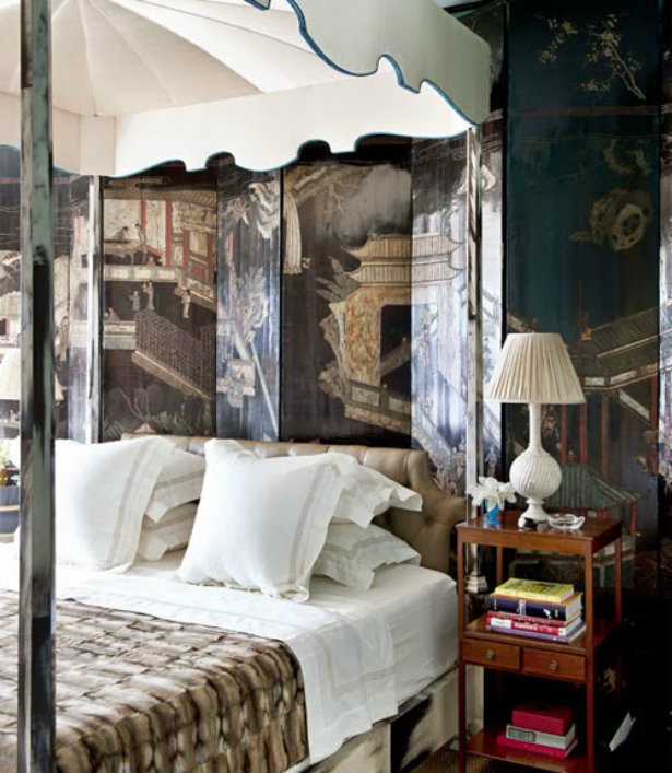
I chose a soft fleshy shade of the terracotta color for my bedroom. It combines so well with other earthy old world colors. In evening light it changes to a rosy side of terracotta which makes it even more elegant and feminine.

Lisa Farmer-Eye For Design
My deep reds work beautifully with terracotta as well. The color terracotta actually is a nice neutral.

John Fowler
When you marry pink to terracotta you create a calmer, more feminine look to your interior.

Cawdor Castle in Scotland
There is a current revival of rich, saturated colors in fashion and home décor. Warm tones, jewel colors and other equally bold color palettes are now taking center stage. This is a natural fit for terracotta which works so well in the company of reds, burgundies, brown, and even bright blues.


via pinterest
This little "pop" of turquoise shows yet another color that works well with terracotta painted interiors.

Bunny Mellon via theglampad.com
Throw out the notion that the color terracotta is only associated with Mediterranean and Spanish interiors. That no longer applies.

Remember terracotta colored interiors can come by way of wallpapers as well as paint.

Mario Buatta via architecturaldigest.com

livforinteriors.co.uk

You simply can’t go wrong by incorporating the terracotta color AND tiles into an old world style kitchen. Since this color works so well with gray, add that color in through gray stone countertops for a wonderful rustic yet elegant kitchen space.

google.com
If you are up to a makeover of a small cozy space try featuring featuring terracotta colored walls.

There are so many shades to play with. Try one that lends to the brown/pink side of terracotta.

In this image you can see how well the color terracotta marries to brown for a luscious interior. The inclusion of a strong mustard yellow take the look to perfection!

via pinterest
Again, notice the yellow!
On the other hand this is a shade of terracotta that almost tends towards an orange-pink.

For major impact in your interior go for tonal walls and furnishings in the color terracotta.

If saturation is too much for you, try painting terracotta above a dado or in this case tiled embellishment. You can also choose to just paint an accent wall only.

The color terracotta matches well with all shades of gray.

Axel Vervoordt
My favorite is to use terracotta in an interior with a lighter gray. To me it has a more stylish and elegant attractiveness.

Steven Gambrell

This pretty bedroom features terracotta colored walls with lighter more colorful accessories.

via Pinterest
While this bedroom, painted in light creamy color, features enough terracotta throughout in the form of accessories that you still feel you are in a terracotta colored interior.


This master bedroom is decorated in a terracotta monochromatic scheme that is layered in brick, rust, cinnamon and warm browns, all colors that are found in the terracotta color spectrum.

Terracotta color will help to make the interior design bright. At the same time, it is not tiring making it a suitable color for a bedroom, giving it a warm atmosphere.

Terracotta, while being a rich color, has enough warm tones it can have a calming effect on an interior. This makes it a good choice for the dining room. This color has enough old worldliness to pull of the crystal chandeliers in this otherwise modern space.

The color terracotta seems to play well with all decorating styles. Here it presents a great background for a traditional dining room........

via pinterest
and yet a contemporary dining area loves it's warmth and energy as well.

facebook.com
You can see in this and the image below how the color terracotta can serve as a lovely neutral canvas for an exuberant mix of colors in your space.

Terracotta is a lively neutral color for your interior that seems to welcome splashes of other wonderful colors. Perhaps it is because it is a true earth tone that naturally exists well with the color of the sky, the grass, and multicolored flowers.

via pinterest
You should select shades of terracotta individually for each room, depending on the purpose of a room. The color has darker shades which are perfect for masculine or trendy modern bathrooms.

google.com
Also there is the softer luminescent shade of terracotta that creates more of an interior with a feminine mood.

Mix in some metallics when decorating your interiors with the terracotta color. This image shows how well brass, antique gold, and especially copper pairs with terracotta.

source unknown
And when decorating the kitchen, try muddied versions of the color terracotta like carrot and pumpkin.

via pinterest
Since terracotta shades always brings warmth, I think it is better to introduce creamier whites in your interior and stay away from stark cold whites.
You may not want to fully commit to terracotta saturated interiors. You can still ride the trend wave by adding touches of the color. Here are some examples of how to do it.

images via pinterest
Terracotta bedding that focuses on the pink and blush shades can create very modern, elegant and feminine rooms. If paired with blacks and gray terracotta coverings take on a more masculine look.

images via Pinterest
Or you could add pops of terracotta color in décor such as curtains, area rugs, a velvet sofa, suede chair, or any other chic soft furnishing.

images via pinterest
Terracotta is the go-to shade for chic inspiring interiors so add a few thoughtful decorative touches by accessorizing.
Click here to see the previous post
https://eyefordesignlfd.blogspot.com/2021/04/decorating-with-chinese-coromandel.html
This blog post was published by Lisa Farmer
In the event that I have not credited the correct source of an image, please contact me at lisafarmerdesigns46@yahoo.com and I would be glad to correct it.