Saturday, April 25, 2015

Decorating With French Biot Jars


I have been drawn to these stone olive jars for years because of their graceful shape and honey colored glazes. They are equally functional as a decorative piece or a garden accessory, the latter being what they are commonly associated with.

The origin of the Jarre de Biot is Biot, a small village from the South of France that was well known as a "potters village" as far back as Roman times when folks lugged around their wine and olives in clay jugs. Biot was rich in sand, quality clay and manganese and the jars were totally made by hand from a process of stacking circled ropes of clay, which are sized to form the shape of the jar, onto a bottom. Upon completion of the jar form the clay is smoothed inside and out by hand. The jar is then dried before going into the kiln. The jars were waterproofed by a thick lead glaze. Jarriers left theirs seals or trademarks of production, on the neck of the jars.

Biot is still making jars. The patina and forms of the jars are unique for the region.


Biot jars were used for storage and transport of flour and other products but the increase of the jars production was linked to the extensive expansion of the olive culture.


What makes the Biot jar unique is it's honey yellow glaze around the neck.

Katie Stassi

Biot jars have moved inside the home where they help to provide an old world feel to whatever space they inhabit.


Biot jars are lovely landscape elements and will give your pool area an ancient feel.


A beautiful container makes landscaping all the more pleasurable and the Biot jar certainly fills the bill.


This Biot functions as an attractive vase for flowers.


Due to the quality of its deposits of clay and stone oven, Biot became the largest manufacturing center of jar production in the Mediterranean. In the mid-17th century, it counted about forty pottery makers.  Biots can stand alone but are spectacular in groupings.

.

In this picture you get a good look at the wonderful yellow glaze that makes the Biot jar so desirable.


Provencal pottery typically does not include a maker’s mark but some examples, such as Biot jars, might include stamps on the side or bottom.


 Biot jars are lovely additions to the neutral tone on tone French style interior in which aged stone and crystal chandeliers are perfect complements to each other.  


Also the glow of Biots yellow glaze is perfectly suited for colorful interiors.

If you like topiary, a Biot jar makes a lovely container. They are fabulous paired with old statuary and other forms architectural salvage.


Bring a topiary inside and plant it in a Biot jar for a decidedly French influence.


This homeowner has thought outside the box and turned a Biot into a side table.

www.pamono.com

There are jars of Biot in North America and South America and throughout the Mediterranean. They are hard to find and usually very expensive. You can find some lovely reproductions however so if you really like the look it can be somewhat recreated without breaking the bank.


Authenic Biot jars can be quite pricey but manufacturers are finding ways to replicate these containers using such material as Hypertufa, a mixture of cement and several other ingredients such as sand, water, peat moss, perlite or vermiculite. Hypertufa is gaining popularity as an ideal medium to create outdoor flower pots and other garden decorations. It is lighter than concrete or stone, and able to withstand the elements. Look for these reproduction containers at your local garden center.


Click here to see the previous post


This blog post was published by Lisa Farmer


Tuesday, April 21, 2015

Decorate Neutral Interiors With A Delicate Touch Of Color


I think a neutral room is so very sophisticated and elegant. There are times I want to throw out everything and start over with a totally neutral pallet. However, I know my love for color would make it impossible for me to be content for very long if I did. I definitely need two houses to satisfy my decorating needs. I am sure there are others out there that feel the same way........  this blog post is for you.

Many people are very nervous about incorporating color into their interiors so they play it safe with neutrals and then secretly long for a flash or two or color. You can have the best of both worlds if you choose wisely. People are opting for neutral backgrounds and adding a few well placed pops of subtle color that can make all the difference in a neutral room. Neutral colors offer elegance and flexibility and you can easily change the feel of a neutral room by adding colored accessories.

Many of this season’s top color trends make it easy to add a gentle touch of color to your interiors. Pastels are big for 2015 with feminine lavenders, soft-sage greens, and warmer pinks leading the way. Don't think of pastels as too feminine. We are talking about more sophisticated shades, not "baby shower" colors. Try adding some hints of color to your neutral room ......it's an easy update!


For some people, decorating with neutral shades of beige feels safe, but others feel that a successfully designed home needs a hint of color.This can be achieved with the simple addition of textiles, paint, artwork and accessories. Paint experts are predicting that soft pastels will dominate this year’s interior color palette.

Jane Moore via Veranda

When choosing the color to add to your neutral interior, remember that the trend in pastels is more fresh, grown-up and chic, rather than childish or overly feminine.


Subtle colorful accessories are a great way to liven up a neutral interior. The zebra rug completes the look.


A neutral space like this is just begging for that unexpected touch of color.

source unknown

Pale shades add character and a hint of color while keeping things light and airy.

via pinterest

Designers are incorporating subtle accents throughout the neutral spaces they’re designing, adding pastel color sparingly to avoid a sweetness overload


Consider muted aqua in the supporting role to your all neutral room.

Neutral colors actually expand your design possibilities because you won’t be limited to a specific color scheme. When you crave a change, simply change accessories.

source unknown

Don’t be afraid to bring multiple soft colors into your neutral decorating scheme to create an eye-catching and dynamic look.


There is nothing overly feminine about this space yet is has a hint of soft blue. The bolder blue tossed in the mix helps to make this a space where a man could feel equally at home. It is all bout he accessories and choosing the right shade of pastel to compliment your neutrals.

By using neutral furnishings, contemporary or transitional furniture, and grown up pink fabrics your room will look chic instead of the "little girl" look that is created by choosing the wrong shade of pink.


You don't have to think baby shower when considering which soft color to introduce to your neutral room.Choose a pastel color you love and then use a color fan deck to choose darker saturations of it. Muted tones are usually "grayed down" versions of the color.


When adding color to a neutral space, light color choices such as blues, lavenders, pinks and soft yellows are great choices. They compliment the romantic feeling of tranquility and restfulness that is typical of a neutral palette.


Teal, a deeper grayed down version of aqua, works beautifully in this bedroom. It provides just the amount of color needed to punch up the neutrals.

via pinterest

Sometimes all you need is a couple of pillows, a throw, or even a fresh bouquet of flowers to bring a hint of color to your neutral space.


Whether your style is modern, transitional, or classic, a neutral backdrop enables the perfect setup for upbeat colors and playful patterns without overwhelming the space.


See how you can enjoy your love of neutral interiors but still incorporate a color or two with great finesse.


Wonderful yellow fabrics and fabulous antique furniture give this living room a welcoming, relaxed elegance.When using yellow with neutrals, stick to more golden shades. I love the hint of aqua!!! 


Don't be afraid to mix different pastels in the same neutral room. There are many options if you lean towards these soft, light hues.

via pinterest

Soft blush colored pillows are enough to give this neutral interior life. Remember you can get by with just a whisper of color.


You can turn a simple living room into one of elegance by selecting varying shades of neutral colors and adding splashes of color throughout the room. 


Click here to see the previous post


This blog post was published by Lisa Farmer


Wednesday, April 15, 2015

Enfilades, Beautiful Architectural Elements


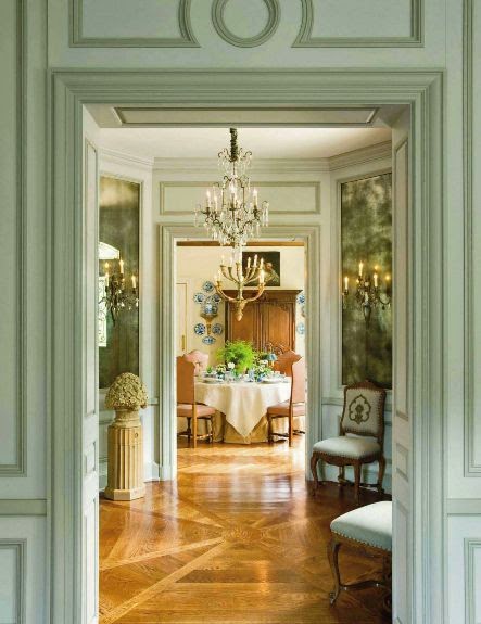
Enfilade, pronounced - on fee LAHD, is a suite of rooms formally aligned with each other in a row so that upon entering, one is provided with a vista through the entire group of rooms. The word comes from enfiler, French for to thread or to string things in a straight line.

The enfilade was a common arrangement in Baroque palaces of the 17th century. The first room would be a public room, with state rooms thereafter, until the visitor was escorted into the royal bedroom which was treated much like a receiving room. The boudoir would lie beyond. Each visitor was allowed to advance as far down the enfilade as their rank would allow. Only those of higher rank would actually make it far enough down the enfilade to meet the host.

I love homes with rooms built in enfilade so in this post I have gathered images of enfilades from homes in the Baroque period all the way up to some present homes that are using this design element. I hope you will enjoy.


via Pinterest 

Enfilade at Versailles
At Versailles enfilades consisting of seven rooms were used as a processional route to the king or queen.

Enfilade at Versailles
A palace might have several enfilades......... for example, one for the king's apartment, one for the queen's apartment, and one for the state rooms.


I adore the visual impact of enfilades. This technique can give even a small house a gratifying sense of depth and spaciousness.

When a home had an enfilade of rooms, many time privacy became an issue, so there was usually an alternate route through secret doors.

Jacques Garcia

A splendid picture with light coming in through enfilade of rooms at Château Champ de Bataille. The lining up of elements- doors, windows, columns, or rooms in a row, make enfilades lovely architectural features.


Enfilades provide a wonderful sense of flow and lovely connection between the decoration of different rooms.


I don't care how up-to-date or how large a home, is it will turn out disappointingly if it does not appeal to someone in a personal or emotional way. The layout of the enfilade does this with it's alignment of open doors that draws the eye to the room beyond and beckons us to move from one room to another.


The Palazzo Reale (Royal Palace), Genoa.

Many times the enfilade ran alongside a garden and you could look out windows as you proceeded through the suite of rooms. It would have been an impressive vista.

A suite of decorative Swedish rooms in enfilade.


I just want to see what is behind that last blue door........all part of the mysterious appeal of the enfilade.

The enfilade in the 300 year old English estate, Burley-on-the-Hill. I believe a house should be romantic. It should stir a response especially when the final space terminates with a view to the outdoors.


A stunning enfilade in this Swedish home, just three rooms deep.


Enfilade of rooms in Holkham Hall, Norfolk, UK.


One space opening from another offers a mysterious sense of distance.......just what lies at the end of this enfilade.

via pinterest


I adore this stunning all white French enfilade.


The enfilade in this Paris apartment gives the sense of spaciousness that is especially true if each room is decorated in similar style.

The enfilade is at it's best when it is a suite of public rooms where people are free to move from room to room. It is a great setting for entertaining.


Many museums and art galleries are set up in enfilade because it is a feature that stirs curiosity and facilitates the movement of large numbers of people through a building.

Chahan Minassian


A view through the State Dressing Room of the enfilade at Beningbrough Hall.

In his enfilade the visitor's eye is drawn forward to the outside the house and into nature.


David Kleinberg
The enfilade is an ancient and compelling design tool that can create a dimensional experience in even the modern home.


Click here to see the previous post


This blog post was published by Lisa Farmer

Related Posts Plugin for WordPress, Blogger...
 Follow Me On Facebook Follow Me On Pinterest Subscribe to my RSS Feed Send Me An Email