Wednesday, September 27, 2017

Blue And White Kitchens......Classic AND Trendy


Whether Old World, Traditional, Country, Farmhouse, French, Coastal, or Transitional, blue and white can be effectively incorporated into practically any style of kitchen or decor. You have not seen this blue/white color combo in kitchens for some time. However, as homeowners tire of the all white kitchen, color is once again emerging and blue is taking center stage. There are several popular shades of blue trending for kitchens at present but for this blog post the spotlight is on the darker blue shades. (Lovers of that wonderful Tiffany blue kitchen, stay tuned, that post is in the works.)

If you are considering a kitchen makeover with a classic yet current modern feel, that perennial blue/white combo might be just the ticket. I have gathered some images of blue and white kitchens that might inspire you. Enjoy!!


You know I am going to put my favorite image first. I love authentic (not what has come to be considered by most) French kitchens. I love an old work table as opposed to an island. If I were to add some blue to my kitchen it would be something like this. However, I know many of you are not interested in going that far with the authentic look so the rest of the images will be more to your liking. Old world or new, blue and white is pretty in the kitchen.

One of the biggest trends happening this year is the incorporation of the blue and white color combo into the kitchen. Blue kitchen cabinets are all the rage but any use of the color blue will refresh your kitchen with an irresistible appeal.

First let's take a look at the royal blue family. If you are worried about whether or not blue cabinets will work well..... worry no more. I'll admit a kitchen saturated in blue may be a bit bold for some. However, others find it a soothing and relaxing shade.

If you only require a touch of blue to satisfy your trend cravings, use a gorgeous shade of royal blue as an accent color. A blue and white color theme looks beautiful and I love how the blue island give this kitchen such a fresh feel. The chandeliers are perfect....classic with a modern twist.

via Pinterest

Deep royal blue seems to bring a touch of class. Plus the dark blue adds depth and dimension to stark white and other neutral walls.

via Pinterest

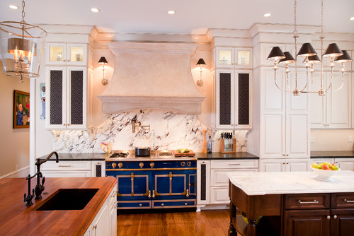
A close-up of that great royal blue range from the blue and white kitchen above. Don't forget that if you only want a touch of blue in your kitchen a blue range is another option.


Paint the walls of your kitchen royal blue for a dramatic yet cozy look. These cabinets are a deeper creamy white but you get the idea.


Royal blue kitchen cabinets can become either contemporary or keep it traditional with a mixture of farmhouse accents. 


The royal blue island and accents work well with a traditional style white kitchen. Brass is also back so if you have some good pieces stored away, bring them back out.

Howells Architecture + Design, LLC

This kitchen with it's white slatboard cabinets sports a pop of royal blue via the tiled backsplash. 


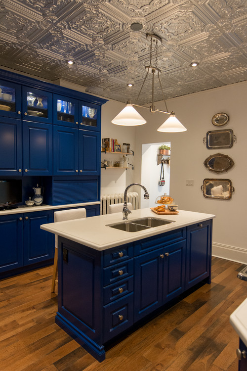
How pretty is this royal blue and white kitchen with the incredible tin ceiling and silver accents.


Photo by Kitchen & Bath Artisans

Remember that if you don't want the expense of changing perfectly beautiful white kitchen cabinets there is always the blue range to add a spark of color.

Now for the navy! With Navy Peony being selected as one of Pantone's colors of the year, it's no wonder blue kitchens have become so stylish.
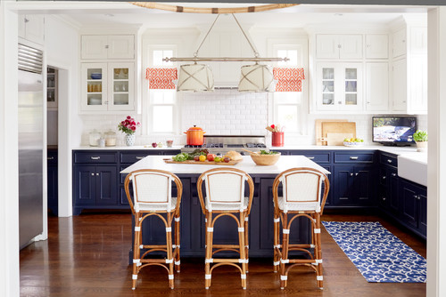
Here the kitchen cabinets are painted in two tones, gray below with upper cabinets painted white to blend into the white herringbone patterned tiles on the walls. The navy blue island and navy and white window treatments finish this kitchen beautifully.


Doing a two toned cabinet design is a great option. Most people prefer the navy blue cabinets for the lower set, while having a white, or off white tone, for the upper cabinets.


Home Bunch

There are several colors that look great as accents in a blue and white kitchen. Try the citrus shades of orange, red, yellow, lime green.

Via Pinterest

Of course blue cabinets is not the only way to jump into the blue kitchen trend. The cabinets in this kitchen all maintain their original all-white paint finish, but the gorgeous blue color is applied on the walls. This really makes the cabinets, white beadboard, and interior moldings pop-out well.


via Pinterest

This is a pretty modern rustic style kitchen with the great exposed beans and hardwood floors. Navy blue  and white works well with this kitchen look. I like the mirror over the sink and of course the rug. Kitchens need rugs too. So many people forget this.


Many of you prefer to not follow a trend because they never seem to last as long as you would like. It is much easier to change the look of a kitchen by redoing the backsplash tiles than it is to replace cabinetry. I really like this look but I am a huge fan of creamy (not stark) white cabinets. This is a great way to get the blue and white look without risking the chance of outdated cabinets in a few years.


A small bit of dark navy blue herringbone pattern tile on the backsplash will be a nice compliment to a white palette and won't leave you feeling overwhelmed.


These blue cabinets have a weathered denim look which works well with the creamy white tile backsplash, warm stone floor, and wooden exposed ceiling beams. The result is a spacious looking kitchen which has a timeless rustic/elegant appeal.


Blue painted cabinets are lovely when wedded to white marble, granite, or other stone counters that have gray striations.


A kitchen with navy blue cabinets and sleek white counter tops accented with stainless steel is certainly hard to rival.


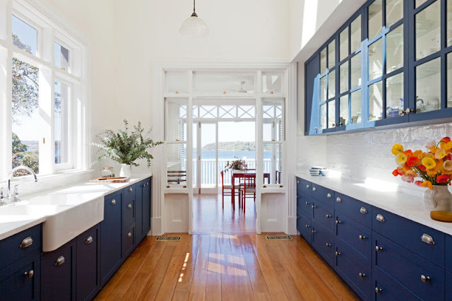
Navy blue cabinets, combined with lighter elements like marble and subway tile, add a crisp fresh feel to a kitchen. Glass front cabinets add to the airiness. Blue and white kitchens are perfection for coastal properties. Great view!!!


This modern kitchen features simple plain blue cabinets paired with brushed stainless steel pulls. This is a great shade of dark navy blue.


I especially like blue and white kitchens with copper accents. This is a great combo. Loving the copper farmhouse sink!


These next few images feature blue kitchens that are unique shades. Even though they are not navy or royal, they fall into the dark blue category and are all very good choice for a blue/white kitchen redo.


European cabinets provide a vintage feel in this kitchen space and the blue color is an excellent complement to the creamy white tile and warm-toned wood elements.

Decor Pad

I really like the style of this kitchen and the Benjamin Moore Courtland blue shade. So pretty with the white subway tile and great farmhouse sink. The rug adds warmth, color, and texture, something that is missing in so many kitchens today.

via Pinterest


A French provincial classic island introduces blue into this kitchen design in a gorgeous way. This muddy shade of blue is a bit greyed to be considered light blue so I added it to the dark blue kitchen list. Add in the blue and white checked chair cushions for a warm French country look.


The owners of this blue kitchen have chosen to go with a light gray and blue color pallet instead of blue and white. Their gray backsplash and flooring compliment  the dark blue gray of the cabinets.These industrial style bar stools complete a great look.

via Pinterest

Another example of how lovely blue/gray/white kitchens can be. 

I hope you have come away with an idea or two on how to work this trend in your own homes.


Click here to see the previous post


http://eyefordesignlfd.blogspot.com/2017/09/my-french-style-dining-room.html


This blog post was published by Lisa Farmer


Friday, September 22, 2017

My French Dining Room


This is second in a series of posts that provide a small tour of my home and concentrates on our French style dining room. Many of you have asked for a tour and we have made some changes recently since both of us have retired and have more time to treasure hunt and curate our home. I promised I would take pictures and post them this year so I hope you enjoy.

I love all styles of French decor from rustic farmhouses to contemporary Paris apartments. However, as I have said before, my own favorite style is French Chateau. The chateau was designed to provide a private country residence for the family away from Paris but was formal enough to receive visiting luminaries. The traditional styles were softened, making the lines less rigid and the overall feel of the home more rustic. The overall result was a country house that was relaxed and inviting while retaining many of the delicate features of the French influence. This old house is certainly not a chateau but it does have alot of character and tall 12 foot ceilings which give it a grand feel. 

I enjoy the warmth and beauty of living with antiques and I try to make the interior space a place where everyone, I hope, feels very much at home.


Lisa Farmer - Eye For Design

For some reason yellow rooms are hard to photograph and get a true color. My dining room never shows up as warm and lovely as it really is because the butter yellow walls never are really captured in a picture. You can look at this picture and see three different yellows. This room always looks smaller in pictures than it actually is because it's hard with my camera to get the width and the height of the 12 foot ceilings at the same time.

Lisa Farmer - Eye For Design

The table is oval with a matlasse cover and small scrunched section of yellow and cream buffalo plaid that sometimes is also used as a flat overlay. I like banquette seating so I'm using a French cane settee and rush seated French provincial chairs. My mom did the needlepoint pillows when I was a little girl. The border is actually fabric and has a French Gothic look, the pattern a bit hard to distinguish in these photos. The tapestry is French. The screen has a fabric bottom and chicken wire top and is used to keep marauding felines out of the dining room when it is being used to entertain. There is a door that can be shut and one opening leading into the hall that has no door, thus the need for the screen. 


Lisa Farmer - Eye For Design

I recently picked up a pair of beautiful carved wood architectural fragments depicting various fruits and foliage, such as pomegranates (symbol of life, marriage and rebirth). Decided to use them on my screen to spruce it up a bit.

Lisa Farmer-Eye For Design

A close-up of the finished product.


Lisa Farmer- Eye For Design

UPDATE
We recently added this antique French sideboard and moved the other piece into the living room.

Lisa Farmer- Eye For Design

This French piece features wonderful ormolu, marquetry and a green marble top.

Lisa Farmer - Eye For Design

Lisa Farmer

Also added the French Louis XIV sunburst mirror.

Lisa Farmer - Eye For Design

I had been looking for an antique sunburst mirror to layer over the mirror above the dining room mantle.

Lisa Farmer - Eye For Design

An old poplar cupboard is now displaying the antique dinnerware I have started collecting. When I changed the dining room my old Limoges sadly didn't work anymore.

Lisa Farmer - Eye For Design

I have started collecting some different antique China patterns for use in the dining room. I don't care for matching sets and would rather opt for a cohesive mis-matched look. These are discontinued of course and hard to find so patience is required. This is Copeland Spode, Raeburn pattern...........

Lisa Farmer - Eye For Design

and this is Royal Cauldon, Jessamine. The soup bowls are Spode Vienna Bird pattern. If any of you dealers and booth owners have any please let me know!!!!

Lisa Farmer - Eye For Design

  Lisa Farmer - Eye For Design

 This is Chanel, striking a pose as usual. A great old oil painting of a castle ruin is above the window. An old poplar cupboard and antique red painted table fill up this corner.

Lisa Farmer - Eye For Design

My favorite French style is the country chateau look when the home was a place to escape to from the city for rest and relaxation, picnicking, hunting, and frolicking about out of the stuffy costumes associated with court or Parisian dress. I love this old picture of French nobles doing just that.

Lisa Farmer

This is looking in through the family room door and is probably my favorite view of the dining room. I love a French hunting lodge look (even though I would never kill an animal) and the hunt tapestry, trophy mounts, and hunt inspired carved wall decor give the effect. All the mounts have been found in antique stores here in the US and some from Europe. I feel like displaying them honors the animal more than letting them waste away in some shop. The entrance of the house is also in French hunting lodge style and leads into the dining room.

Lisa Farmer

I am searching for a French bombe chest to go here under the tapestry and foolishly let a painted one slip through my fingers recently for which I kick myself regularly. There will be another though....just waiting for an auction or Craigslist find.

Lisa Farmer - Eye For Design

Playing around with a vignette in the dining room. French girandoles feature and old shepherd and his son, also old  framed hunt tapestry.

Lisa Farmer - Eye For Design

The view looking from the dining room out into the French hall which I painted in a faux limestone technique.

Lisa Farmer - Eye For Design

Trying to take pictures from all angles so you can have a panoramic view and not claiming to be a good photographer. I was going to have some professional pictures taken for my website but now that I'm retired it just doesn't seem that important.

Lisa Farmer - Eye For Design

This door has always perplexed me because it never really seemed to belong in this room. I recently bought a great old screen at auction and the place I wanted to use it would only accommodate  three of the four panels. We decided to hang a panel on the old door and it works for us.


Lisa Farmer - Eye For Design

The screen is gold burnished leather with oil painting of swags, bouquets, and architectural elements. Hard to see in the picture but lovely in the right light.


Lisa Farmer - Eye For Design

UPDATE
I recently made an update with this antique French piece. I moved the other into my office. Also found this candelabra and paid $40.00 for it and it's twin which is in my bedroom now. They were in pieces but all pieces were there with exception of one prism. I guess people thought it was ruined. Glad they did!!!


Lisa Farmer - Eye For Design

The French trumeau mirror was an unbelievably great find.

Lisa Farmer -Eye For Design

This old etching of Louis XIV on horseback during the Carousel of 1662 is interesting. The Carousel was an event celebrating the birth of the Dauphin and 25-year old Louis XIV wanted to make the most of it. It was held on June 5, 6 and 7, not at Versailles but between the Louvre and the courtyard of the Tuileries, now called the Place de Carousel. Close to 15,000 people gathered to watch the grand spectacle.

The theme for this event was a tribute to the five most exotic countries at the time and each was represented by a quadrille. In turn each quadrille was headed by a member of the court and each quadrille had its' own color scheme, theme, etc. associated with that country. The five quadrilles would perform mock charges at each other where they fired small, scented balls in bright colors to amuse to spectators. Not only the courtiers were clad in lavish costumes. Their followers wore helmets shaped as dragons, fish and parrots and even the King's horse was dressed to impress.

Lisa Farmer - Eye For Design

My favorite time in the dining room is in the evening when the walls take on a wonderful new color and the light from the chandelier and girandoles make it kind of magical.

Lisa Farmer - Eye For Design


If you would like to see more pictures of our home you can visit  the living room by clicking on the following link:

Click this one to see the entrance hallway 
Click here to see the previous post

http://eyefordesignlfd.blogspot.com/2017/09/decorating-with-multiple-layered-mirrors.html


This blog post was published by Lisa Farmer


Related Posts Plugin for WordPress, Blogger...
 Follow Me On Facebook Follow Me On Pinterest Subscribe to my RSS Feed Send Me An Email