


To "pop" or not to "pop", that is the question. Do you only need a pop of color or are you going to go bold with it? Sometimes color is best delivered in measured doses. Purple can certainly fall into that category. It is a great color that has been associated with royalty, power and wealth for centuries. In fact, purple's elite status stems from the rarity and cost of the dye originally used to produce it.
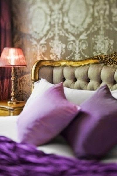
The eyes are immediately drawn to purple upon entering a room whether it is present in artwork, vases, soft sweeping drapes, lacquered rich wall color, tufted bed fabric, velvet pillows, elegant bedding… the list goes on. Since purple is so stimulating, (unless it is a muted shade), too much of it tends to weary the eye after a while. It is an easy color to become tired of if you saturate your space and before long you will be wanting to redecorate.This is another good reason to let only pops of color satisfy your purple cravings. My advice is to have a neutral backdrop and just add pops of your favorite shade of purple. A neutral backdrop can stand the test of time, and pops of color in your accessories can easily be changed for a current look.
Take a look at these inspiring images that embody beautiful design and ways to really make purple pop.

If painting your walls purple intimidates you, start with just a pop of purple on your front door. Doors can make a big impact with a small investment.

The purple "pop" created by this classical bench is minimal enough to not over power the room but vibrant enough to give it alot of life.

This dark, atmospheric interior needed a pop of color and the purple chair really livens up the space.

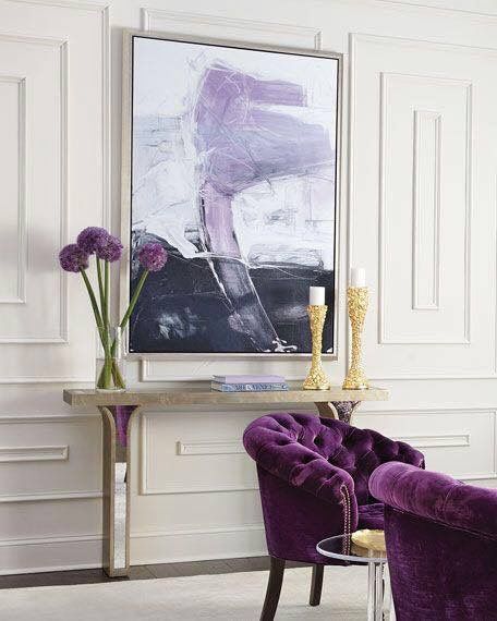
You have heard about the decorating "rule of three" In decorating it is best to work in odd numbers especially 3 or 5. Here is an example of how a repetition of at least 3 pops of purple ( the flowers, lights, and pillows) help to make it look cohesive and decorated.

I also like the one big pop of purple created by this painting. It is
unexpected and makes an attractive backdrop. One works well because it is an odd number.

Your pops of purple don't have to be huge. Here a pillow and tea set along with bright yellow daisies energize the space.

Analogous colors are colors which are side by side on the color wheel. This room has two pops of color, purple and blue. These two colors are analogous so they work well together in the space.
pinterest.co.uk

The fact that the color of the walls is echoed in the accessories really ties the room together. The pillows and cable knit sofa throw are the pops of purple that brighten this space up.You could create the same effect by having a throw pillow and a lamp that has a similar color, or matching bedside lamps, or a vase and a chair, etc.

via pinterest
Give emphasis to a neutral room by adding a few smart hits of color. I would prefer a neutral lampshade and maybe a few less small purple accents, but otherwise this is a pretty space.

Complementary colors are any two colors which are directly opposite each other on the color wheel and a first glance seem not to “go” together The theory is that these colors set each other off, create contrast, and can actually look really good in the same space . One interesting complementary color combination is yellows, golds, and purple. See how the tufted purple seating really pops in this room.

If you are one of the brave ones, why not go crazy with it! Make an entire sofa a bright pop of purple.

Madeline Weinrib
Or maybe create your pop of purple with a big area rug that will anchor the room and tie in your other purple accessories.

The purple upholstered French chairs really pop against the olive walls. These deep in hue colors are very grown-up and sophisticated.

ZsaZsa Bellagio

The accent wall is a familiar concept for creating a pop of color. Yet partial surfaces, smaller architectural elements, and furnishings are ripe for color too. Here the pops of purple are in deeper shades of plum. Remember it doesn't always have to be bright purple.


You get it, let your eyes travel around the room and count the repetitions of color.

via pinterest
Interior doors can also deliver a pop of color to a hallway or neutral room.
.jpg)
Even in a colorful eclectic interior pops of purple still stand out.

Ceiling are often only after thoughts but you can see here how this unexpected pop of purple brings a touch of whimsy to a crisp space.

This everyday table becomes fun and exciting when it is surrounded by brightly colored chairs creating pops of purple. As an added benefit, mismatched pieces can be unified with the same color. If you have several odd chairs....paint them the same shade of purple.

Gray is still a popular neutral. Many times a color is needed to liven things up and purple is perfect in the supporting role.

source unknown
There are a few ways you can easily add some color to your life. The two easiest being throw pillows and accessories! That way you can always keep up on those ever changing trends. They’re also a great way to add just a touch of of color to an already great space.

A coat of paint can transform any wooden furnishing into an accent piece, whether it is a dresser, side table, bed frame or arm chair, just to name a few.

Pops of purple make all the difference in a neutral room, adding life to the room and preventing it from feeling too sterile.

The eye does not tire of neutrals as easily as it does of color, which can even be introduced in small details like a bowl of fruit or a vase of flowers.


A pop of purple can make a space feel exotic and placing them in a decidedly neutral environment really makes them stand out.
Click here to see the previous post
This blog post was published by Lisa Farmer

.jpg)


.jpg)


